Most of the charts used today in data visualization among virtually all of the social sciences (economics included–you can’t get out of it this time) derive from the original design of William Playfair (1759-1823), political economist and a product of the Scottish enlightenment, and Johann Heinrich Lambert (1728-1777), a mathematician of the Alpine inclination. Together, they more or less popularized the idea that data could be presented to a mass audience.
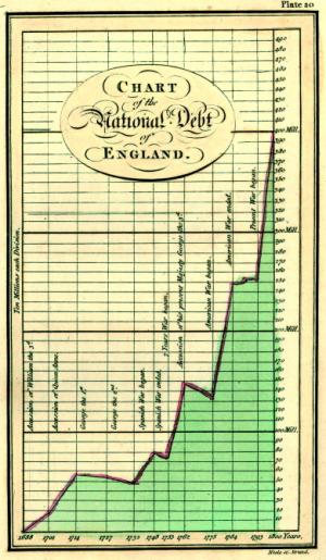 (The power of the long tail. Chart by William Playfair, 1786. via Robin Good)
In the 1790’s, as people got wind of his pioneering work, they accused him of lie-telling and fabricating his data. The academe, acclimated to the traditional tabular graph (see my post on data mining vs. visualization), resisted his innovations for, say, 150 years.
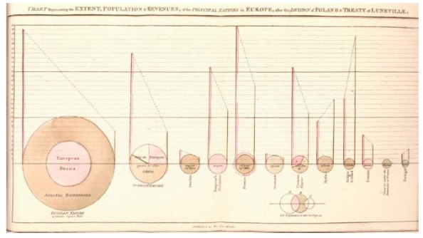 (Playfair pie chart, via VML)
Playfair’s Commercial and Political Atlas presented the first line chart in his examination of the imports and exports differences between Britain and various other countries. Like many researchers after him, he grasped on the fundamental strength of visual data: ease of rapid comparison among a large number of variables.
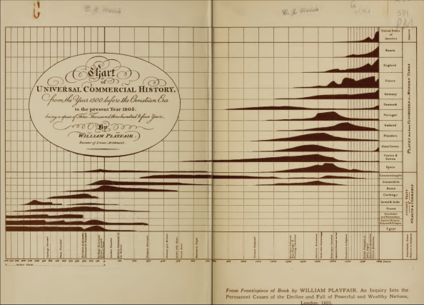 (The Universal Commercial History, Playfair, 1805. via Mrinal Wadhwa)
And, like many political economists that followed, he used data visualization to ease his wild guesstimates a little. That’s alright, though, because in the end he built something truly revolutionary out of Priestly’s work.
Now Priestly was a somewhat different character. More of a natural scientist (he is often credited with discovering oxygen), his charts had an explicitly didactic purpose: Priestley believed [A Chart of Biography (1765)] would “impress” upon students “a just image of the rise, progress, extent, duration, and contemporary state of all the considerable empires that have ever existed in the world”. (Sheps, 146)
Of course, as a Providentialist, he really just wanted to impress on his students the power of God through history (as opposed to, say, the power of compound interest). But his charts were an instant hit:
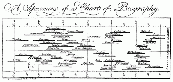 (via Wikipedia)
I’m not sure why. But I would definitely consider Playfair’s graphics an evolution of Priestley’s work. Even his more conventional works are much improved over tabulations:
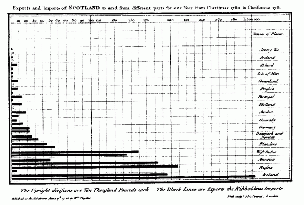 (via Wikipedia)
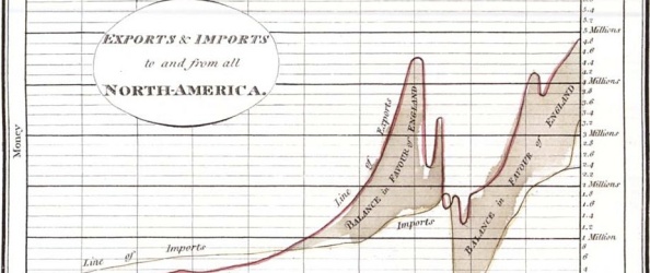
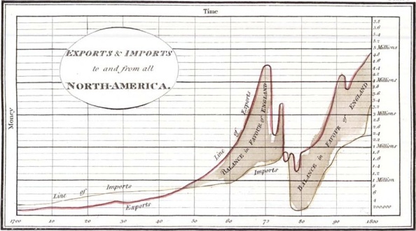
What I like about his work is that it shows how from its inception, visualized data could easily demonstrate causality in a way that would take much more space to explain in words. Take Playfair’s chart of Britain’s trade balance with North America:
(via Doug McCune)
Look at the 1770’s. Notice any changes? Right. Without having to really explain anything, we can clearly see the trade effects of the Revolutionary War. Of course, we need to explain the causal mechanism at work as well as include control variables to explain our parameters…but still.
Awesome.
Playfair, William. 1785. The Increase of Manufactures, Commerce, and Finance, with the Extension of Civil Liberty, Proposed in Regulations for the Interest of Money. London: G.J. & J. Robinson.
Playfair, William. 1805. Statistical Account of the United States of America by D. F. Donnant. London: J. Whiting. William Playfair, Trans.
Sheps, Arthur. “Joseph Priestley’s Time Charts: The Use and Teaching of History by Rational Dissent in late Eighteenth-Century England”. Lumen 18 (1999): 135–54.
Related Articles
- Visualization vs. data mining (seeingcomplexity.wordpress.com)
- 3 Views on the Difference Between a Data Visualization and an Infographic (readwriteweb.com)
- Edward Tufte auctions off his library [bioephemera] (scienceblogs.com)
Leonard
04/17/2013
Quality content is the main to interest the viewers to visit the web site, that’s what this web page is providing.
blog żakowski
07/19/2016
There’s definately a lot to know about this subject.
I like all the points you’ve made.